Typography is the single most underrated skill in Malayalam content creation. While everyone focuses on video quality and thumbnails, the creators who understand typography consistently have higher engagement rates, better brand recognition, and more professional-looking content.
This guide covers everything a Malayalam social media creator needs to know about typography in 2026 — from font selection to color theory to platform-specific rules.
What Is Typography and Why Does It Matter?
Typography is the art of arranging text in a way that makes it readable, clear, and visually appealing. For Malayalam creators, good typography means:
- Your audience reads your message immediately (no confusion)
- Your brand has a consistent, recognizable visual identity
- Your content looks professional even with a basic background
- Viewers stop scrolling because your text catches their eye
The 4 Typography Principles Every Malayalam Creator Must Know
1. Hierarchy
Hierarchy means using different font sizes and weights to guide the viewer’s eye. The most important word should be the largest. Supporting information should be smaller.
Example for a YouTube thumbnail:
- Main title (Baloo Chettan 2 ExtraBold, 120px): “ഇത് ആരും കണ്ടിട്ടില്ല!”
- Subtitle (Noto Sans Malayalam Regular, 48px): “Real Story”
2. Contrast
High contrast between text and background is non-negotiable. White text on dark background or black text on light background reads at a glance. Low contrast = invisible text.
Safe combinations:
- White text + dark photo background
- Black text + white/yellow background
- Yellow text + dark blue background
- Orange text + black background
3. Spacing
Letter spacing (tracking) and line spacing (leading) affect readability dramatically. For Malayalam:
- Headlines: tight tracking (-0.02 to 0em)
- Body text: normal to loose (0 to 0.05em)
- Line height: 1.4–1.6x the font size for body text
4. Font Pairing
Never use more than 2 fonts in a single design. The standard combination:
- Display font (large, expressive) → Manjari, Baloo Chettan 2, or Keraleeyam
- Body font (readable, neutral) → Noto Sans Malayalam or Suruma
Platform-Specific Typography Rules
YouTube Thumbnails
- Font: Baloo Chettan 2 ExtraBold, Uroob, or Manjari Bold
- Max words: 5–7
- Min size: Text must be readable at 25% of the original size (simulate mobile viewing)
- Effects: 3D extrude + drop shadow for maximum pop
- Canvas: 1280×720px
Instagram Posts (Square)
- Font: Manjari, Chilanka, or Keraleeyam
- Canvas: 1080×1080px
- Rule: Center the text, leave 10% margin on all sides
- Style: Gradient text or solid white on gradient background
Instagram Stories / Reels Cover
- Font: Gayathri (elegant), Dyuthi (artistic), or Chilanka (casual)
- Canvas: 1080×1920px (9:16 ratio)
- Rule: Text in top or bottom third — never the dead center
WhatsApp Status
- Font: Chilanka for fun, Rachana or Meera for traditional
- Style: Large central text, minimal other elements
- Download: Transparent PNG, layer over a photo background
Facebook Posts
- Font: Noto Sans Malayalam or Suruma (most compatible)
- Size: Large enough to read without zooming
- Keep it simple: One headline, one supporting line maximum
Font Personality Chart
Choose your font based on the emotion you want to convey:
| Emotion | Font | Why |
|---|---|---|
| Urgency / Breaking news | Baloo Chettan 2 Bold / Uroob | Heavy, immediate, and impactful |
| Trust / Authority | Noto Sans Malayalam / Meera | Neutral, professional, and reliable |
| Elegance / Premium | Manjari Thin or Gayathri | Refined letterforms for high-end feel |
| Humor / Casual | Chilanka | Handwritten, approachable, and friendly |
| Traditional / Cultural | Rachana or Keraleeyam | Calligraphic, heritage-rich, and formal |
| Modern / Tech | Anek Malayalam | Variable, geometric, and futuristic |
| Artistic / Creative | Dyuthi | Decorative and unique strokes |
Common Typography Mistakes Malayalam Creators Make
- ❌ Using 3+ fonts in one design — creates visual chaos
- ❌ Light gray text on white — unreadable on mobile screens
- ❌ All caps in Malayalam — Malayalam script doesn’t have uppercase; forced casing looks wrong
- ❌ Font too thin for thumbnails — thin fonts disappear at small sizes
- ❌ Stretching text — never scale text disproportionately; it distorts the letterforms
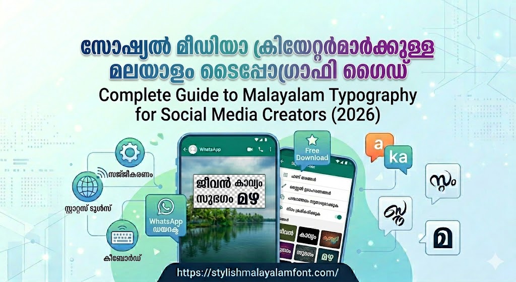
Your Typography Toolkit (All Free 2026)
- Font generator with 200+ fonts: stylishmalayalamfont.com
- Google Fonts Malayalam collection: fonts.google.com/earlyaccess#Malayalam
- Contrast checker: contrast-ratio.com
- Color palette generator: coolors.co
FAQ
How many fonts should I use in one design?
Maximum two — one for headlines, one for body text. Using more creates visual confusion.
What is the minimum font size for mobile-readable Malayalam text?
16px for body text, 24px minimum for captions. For thumbnails, ensure the text is at least 10% of the image height.
Should I use the same font across all my social media?
Yes. Consistent font usage = brand recognition. Pick one headline font and use it everywhere.
Create professional Malayalam typography free → stylishmalayalamfont.com